I've done some more personal research that I decided that I'd add to the blog as before, I don't think I explained enough of what the logo was really about, I just explained why I did and did not like it.
The first band logo I'm going to talk about, is Nirvana's band logo. I believe the bold yellow colour would represent either that they are a quirky band or that they want to bring joy to the music because yellow usually mean's thing's such as "happy" and "joyful". I would also want to point out about the quirky little face. I think this show's the expression that they are a free expression and they want to be different compared to other band's because they aren't like the rest, they want to stand out.
The next band logo I'm going to talk about is "Slipknots" who musically produce something different compared to Nirvana hence why I'm using it, because I want to explain different types of bands and how you know what "genre" they fit in because of the way that logo look's, below is "slipknots" logo which I will explain to the side of it.

As we can tell, Slipknot's logo is completely different looking compared to "Nirvana". I believe in Slipknots logo it show's that this band is more of a "metal" band, and I know this band is in the genre as a "nu-metal" even though I don't actually listen to this band myself. I believe this band show's that it want's to be shown as "metal" because of the way "Slipknot" looks. The logo has like some like spikes sticking out of it which could show that the bands trying to look "scary" as that is the first impression I get from it. There is also a background design that is shown on Slipknots logo which look's like look it could fit into the metal band genre criteria. The background design could show that this band is fitting itself into a criteria before actually being in one. The background design on this logo, by background design I mean the black design behind the writing could also that show us that they think their music "is sharp" or "dark" because of the design and colours they have used to promote their band logo.
Moving on, I will now be looking at another logo, from two other band's before I finish this up. I've researched some more logo's that show a lot through their band logo. The first one I'm going to talk about is the logo that is for "The Rolling Stones" which is a worldwide logo that is usually known by the majority of people.
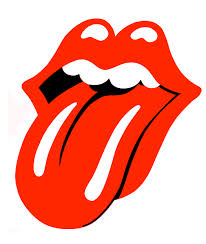
In this logo, a lot of thing's are represented and shown even though their is no text telling us what this band is or what music it produces. The big mouth drawn as a cartoon is representing the main singer; it could represent that the singer(being Mick Jagger) has a big mouth, because he does, but it could also represent that his a singer, that's why the mouth is open, because the mouth could represent Mick Jagger is the singer of the rolling stones. The logo could also represent how free this band is and how they can get away with a lot, that's why the tongue might be sticking out which is shown in the logo. The logo is also in the colour red, and red could either mean danger or passion, so adding red to their logo could mean that they are trying to show that they are a passionate band who want's to produce good music for their fans, or it could say they are a pretty rebellious band who enjoy messing around while there producing music for their fans.
The last band logo I am going to talk about today is a very famous band that is well known all over the world and that band is the famous British band that is otherwise known as "Queen". I believe that Queen's logo goes into more depth than it seems.

For example, as I said before the band is called Queen and I think they logo they use to promote their band tell's us a lot. As we can see, in this logo they have used "two lions". I believe this would tell us that they are a "proud to be British band" as I believe it tell's us this because Lion's are usually used to promote England, so I believe it give's us the idea that this band are proud to be British, however I noticed a eagle looking bird above the top lions in this logo. I believe this could tell us that the band "Queen" wanted to take over the US when they were preforming. I think this because the USA links with eagles in the fact they use them sometimes to promote this USA sometimes. I've also noticed that all the three animals that are displayed are looking "happy" which could show that this band was cheerful most the time and they wanted to portray that through their music.

No comments:
Post a Comment